Showing posts with label M2. Show all posts

Wednesday, 12 January 2011

Ass 207 - Task 1c - Portraiture selection

first selection

Intentions/purpose of the photography to be undertaken :-

For this photographic session I am going to take a series of portraiture shots of Lee in his work clothes, during this photographic shoot I will focusing on the head and shoulders, I might also try and incorporate some work props in to the session.

Reasons for selection of theme (including inspiration from the work of others) :-

I have been looking at the images of Ian Winstanley, he seems to be able to capture the personality of each individual sitter the use of strong lighting technique and good composition helps to create great portraiture shots time after time. I will be using his shots as an inspiration source to try and improve myself during this session.

The photo imaging equipment and medium that will be used and why :-

For this photo shoot I will be using my Canon 500D camera, 18-55mm lens, shutter release cable and a hot-shoe adapter linking the camera configuration to the studio lights, during the shoot I will use a single Barn Door light, by using the door reflectors panels I can control the direction of the light and how it falls acrosss the Lee, I will also use silver light reflectors to bounce light back at my sitter.

Techniques that will be used and how they will help convey the visual message :-

For this photographic session I will be moving the light source to alter the way in which the light falls across the sitters, I will also move the position of camera from time to time to try and capture different viewpoints and to see how this alters the image composition.

Once I had discussed and it had been agreed with the tutor we set-up a black Colorama background in the studio, I wanted to keep the background as dark as possible so black background was always going to be the choice. The photographic session lasted just over an hour and quite a lot of shots were taken during this time.

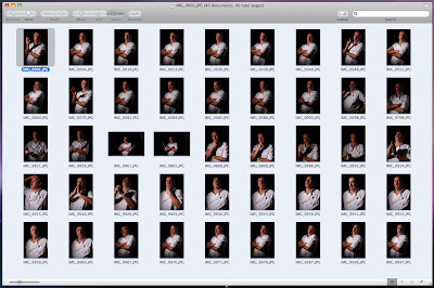
Once I had downloaded the images from my camera I was able to take a closer look at each individually shot, once I started the selection process I graded the images to help narrow down my choice to a selection of 45 images, the chosen images had to meet with the following requirements; good focus on the face, balanced lighting, good posture and composition, the selected images were imported into Lightroom where I was able to batch processed them. Once I had exported the images from Lightroom in to a new folder I reviewed the images once again and eventually made a selected of just 12, these 12 images were then opened in Photoshop ready for the next stage. 

The selected images were opened and copied acrosss into a new file which had a layer mask and picture keyline, each of the images were then reduced or enlarged to fit the picture area so that they would have a co-ordinated look and consistent size, once I was happy with each image I then individually applied some layer filters to help create the bleached look I was hoping for, the final part of the process was to save each image individually as a Hi-res and Low-res file ready for up loading to my blog.
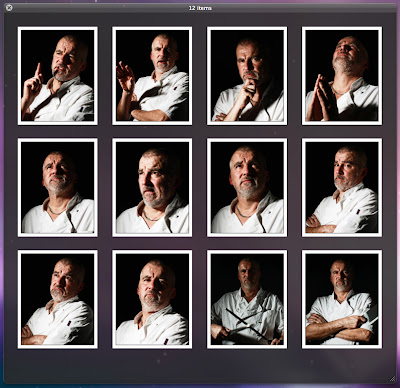
the chosen 12

Friday, 3 December 2010

Ass215 - digital image manipulation, part 5

image manipulation gallery


original image
processed image


masks and cropping

overlay, mask and crop

original processed image
greyscale manipulation
colour tints
tints and masks
retro, jumpers for goalposts


mask, layers and cropping

Ass215 - digital image manipulation, part 3

Black and White conversion

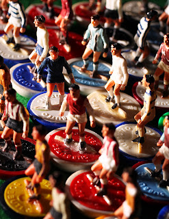
cropped original colour image
To convert a colour image in Photoshop to Black & White there are a few different ways for this task to be completed, the quickest and simplest way to convert an image is to change the colour mode to Grayscale, this way of converting the image discards the colour from the image coupeletly and cannot be reversed once the file has been saved.


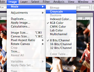
fig.1
To change the colour image to grayscale (fig.1) we need to alter the colour  Mode, this can be found on the header bar under the Image heading, once the image has been converted to grayscale it can be worked on further in Photoshop by using various filters, layers and any number of combinations.

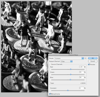
fig.2
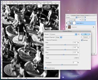
The second possible option is the Chanel Mixer (fig.2), this is found via the Image header under the Adjustments sub-window. With this option you click the Monochrome button first and then you use the RGB slide bars to control the look of the image, the source chanels should make up a total score of 100 for the best result, once you are happy with your image you click OK and a chanel mixer layer is located above the original image, this way of working allows you to retain the colour image within the PSD file.

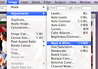
fig.3
fig.4

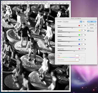
For the third convertion (fig 3.) you could use the Black and White layer option, this option is also found under Image heading scrolling down to Adjustments and in the sub-window you can select Black and White..., this option automatically converts the image to grayscale, providing you with 6 slide bars to alter the image (fig.4), giving you good control on the final output, also with this option you have some saved Prests which can be used as a starting point to manipulate the image. The final tool within this option is the Tint tool, by using this option you can convert the image to a single colour image.

fig.5
An alternative working method is to use a layer mask, by clicking on the Create new fill or adjustment layer button (fig.5) found at the bottom of the Layers pallet, an adjustment mask is positioned above the colour image, this works for both the Chanel Mixer and the Black and White layer option.

fig.6
By using this method the original image can be worked on in the grayscale mode without the loss of colour to the original base layer image, by clicking on the mask layer you open up the mixer window (fig.6) this is where the image can be manipulated, once you are happy with the image it can be re-named and saved as a PSD, saving the image as a PSD file allows you to re-open the file and make as many changes and tweaks as you require in the future.

Thursday, 25 November 2010

Ass 211 - Task 2a - Presenting photo images


Ass 211 - Task 2b - Presenting photo images

Automate options (fig.1)

Once I had download all of that days photographic shots in to a new folder on the computers desk-top, I opened up the Photoshop software to create a new set of contact sheets.

By clicking on File in the main menu heading bar, a pull down window opens, scrolling down the various choices to Automate, a sub-window opens with additional options, by selecting the Contact Sheet II a new independent window is opened (fig.1). This is where you can make bespoke choices for your contact sheet - page size, resolution, number of images per page and so on, once you are happy with your choice of set-up, you click ok and the software starts to process the images in to contact sheet pages, these pages are then saved or printed off ready for the selection process to begin. Once all of the contact sheets were printed I was able to start the selection process, what I was hoping to show in my final selection was an overview of a great day out.

marked-up contact sheets

The next part of the process was to reduce the days shots down to just 40 in total, once this had been done I produced a new set of contact sheets which were also printed off, with these new sheets I could look at how each individual images might be cropped and also work together as part of the final gallery.

Because I would be presenting the final images together in a printed portfolio, I had decided to present the images in a rectangular landscape format - one size to fill all, this decision would also have a bearing on my selection of images, some picture would work better in this format than others.

Once the final ten images had been selected they were processed within Photoshop, this is where I made slight adjustments to the image contrast and colour balance, once this had been done each individual image was worked on further, first I duplicated the image layer then I applied an unsharp filter mask to the new image layer, depending on the image and how the filter looked the top layers opacity is reduced, this reduction is individual to each separate image, the two layers are then merged, with the image layer still unlocked I resized the canvas to 250mm(w) X 210mm(h) at 240dpi, the image was then positioned, reduced or a combination of both to fit the canvas area giving the best composition for each individual shot, once I was happy with result the image was then cropped to size so that it fitted the canvas area exactly.

Note: Another way in which this process could have been undertaken was to use Layer Masks to crop the image, the benefit of this procedure is that the original image would still remain intact (full size), this option allows you to move the image within the mask area giving more flexibility if you thought that you might need to reposition the image at a later date. This layered option would be saved as a .psd file. This file can be used to produce alternative images and a good working method that allows you to return to the master file at a later date.


fig.3
 The canvas size was then increased to 270mm (w) X 230mm (h), by using the Magic Wand Tool (fig.3) I could make a selection of the empty area around the image, I then created a new layer and applied a black stroke to the selection (fig.4), a second layer was then created and a grey fill was applied to this layer this would be seen as a wide grey image border.

fig.4
Once I had carried out the above, I then highlighted the image layer ready for the next stage. Clicking on Image in the main menu heading bar, scrolling down to Adjustments and then in the sub-window to Black & White option a new window opens (fig.5), this option is where I would be able to alter the image colour from mono to sepia by clicking the Tint button and using just Hue and Saturation scroll bars to alter the colour, after looking at various options I decided on a selection of Hue 20° and Saturation of 12% (fig.6).
fig.5
fig.6
Each part of the above procedure would be followed and then applied to the other nine images individually, once this had been done for all of the images the final part of the process was to name the files and choose what format the images would be save in (fig.7).

fig.7
For this set of images I chose to save the files as JPGs, with JPGs the amount of compression can be adjusted, the trade-off is between storage file size and image quality, by using the scroll bar you can control the amount of compression - 1 being low quality and 12 giving very little perceptible loss in image quality, saving as JPGs would also make it easier for me to send the images to the printer later on due to the reduced file size (fig.8).

fig.8
The final part of the assignment will be to present the images together as a collection, this is going to be done as part of a printed portfolio presented at the end of the course. At the printing stage I will be looking at various types of paper stocks, I could choose a Hi-gloss paper very similar to photo paper or I might choice an uncoated stock “very arty” each type of paper will have an effect on the final images and how it looks to the viewer, the options are many and might be dictated by cost and available time.

An alternative way to present the final images could be to use an online gallery sources such as Flickr or Blogger, with both of these options the gallery would be ready to view worldwide as soon as the images had been uploaded and published for the public to view, this option would be very cost effective as it is free to most users at the moment, to support this option an email link could be mailed out to world wide contacts informing them of your new online image gallery.

Monday, 8 November 2010

Ass 211 - Task 1a & 1b - Presenting photo images

The first stage of the process was to download the images to a new folder on my computer desk-top, by selecting all of the images within the folder and touching the space bar I could view an index sheet and take a closer look at each individual image approx.150.

contact sheet


Once I had taken a look at all the images within the folder I started the selection process, I wanted to select pictures which would convey Pollys personality, 24 images were chosen. For the next stage I opened Photoshop and used the Automate feature to create a contact sheet, once I had this file I could either print it off and mark-up the sheet in a traditional way or I could view the same file on the computer and mark-up each individual image as to how it might be cropped, I could also look at how these images might work as a complete presentation, various crop boxes were overlayed, positioned and re-positioned until I felt that I new which images would work best together for my final image choice and how they would be cropped.

I had decided to present the images in a square format, to achieve this I would have to open each of my selected images in photoshop, the first part of the process was to crop the image to the required composition, I would then unlock the background layer and make sure that the canvas size was 300mm square, the image would be either enlarged or reduced to fit the canvas the image was then flattened and save.

The next stage of the process was for the background layer to be duplicated and an unsharp filter applied to the top layer, depending on the image and how the filter looked the top layers opacity is reduced for a natural look, the two layers are then merged and reduced to 97%, to create the border a new layer was added and positioned at the bottom of the file and a black fill was applied, these layers are then merged and reduced to 95%, a second new layer was then added with a white fill and positioned below the image layer and the file was flattened, the final part of the process was to reduce the image file size to 250 mm square at 240 dpi, this process was applied to all 10 of my chosen images.

The final part of the assignment would be to present the images together as a collection, this might be done as a printed booklet, it might be as a set of individual art prints presented in a traditional portfolio case or even as a single canvas with all the images shown together each of these options might prove expensive depending on the chosen supplier and the quality of materials used.

Another way to present the final images would be to use an online gallery sources such as Flickr or Blogger, with both of these options the gallery would be ready to view worldwide as soon as the images had been uploaded and published, this option would be very cost effective as it is free to most users at the moment, to support this option an email link could be mailed out to various contacts world wide informing them of the new online portfolio.

bored now...